


Become
A Yogi
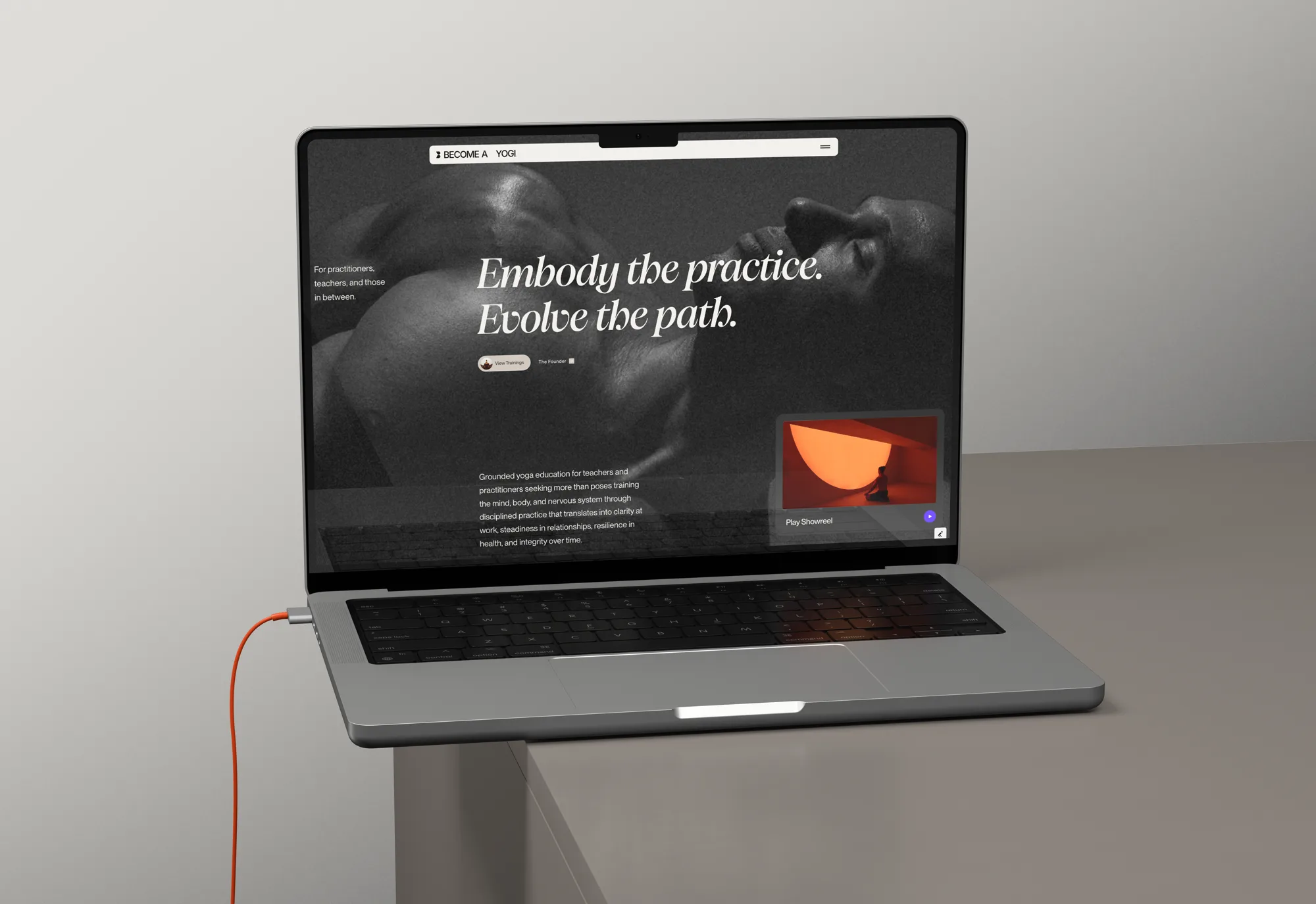
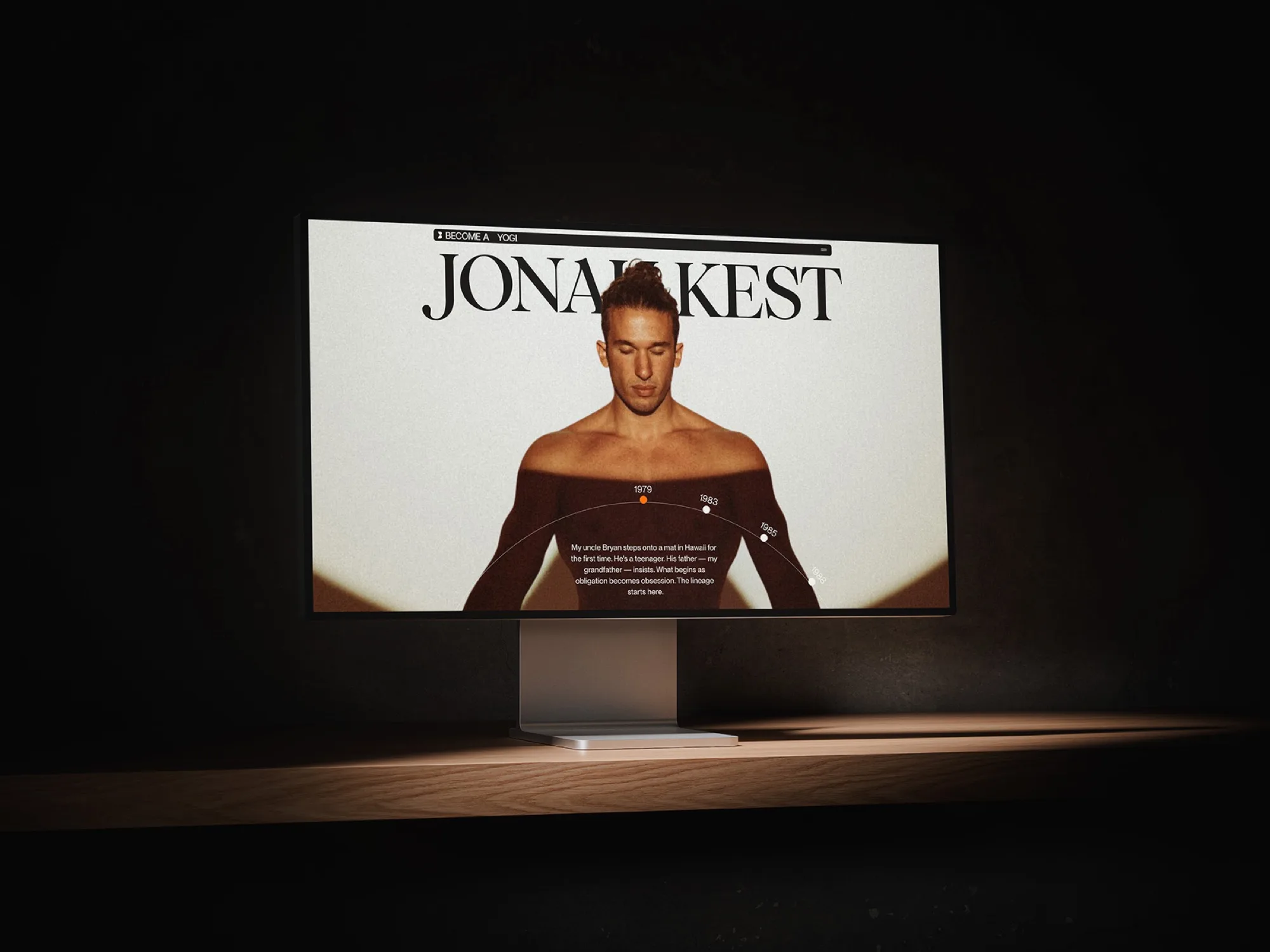
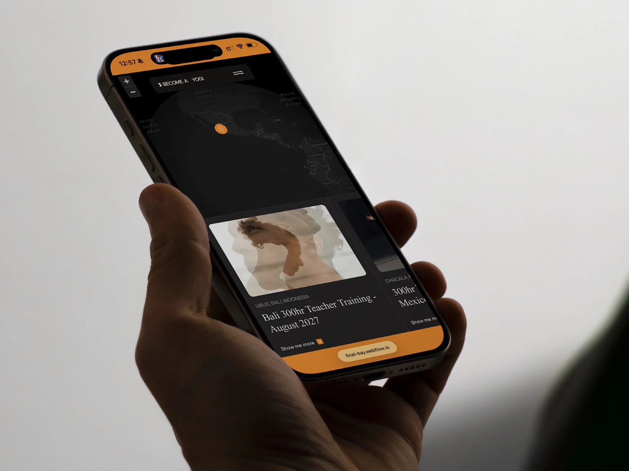
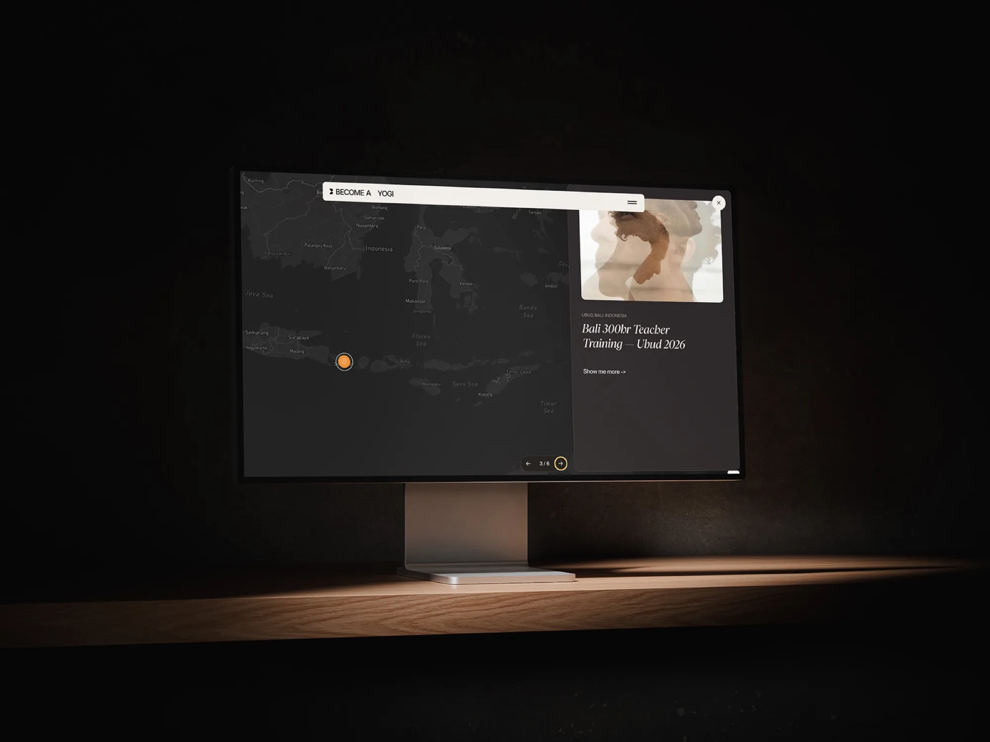
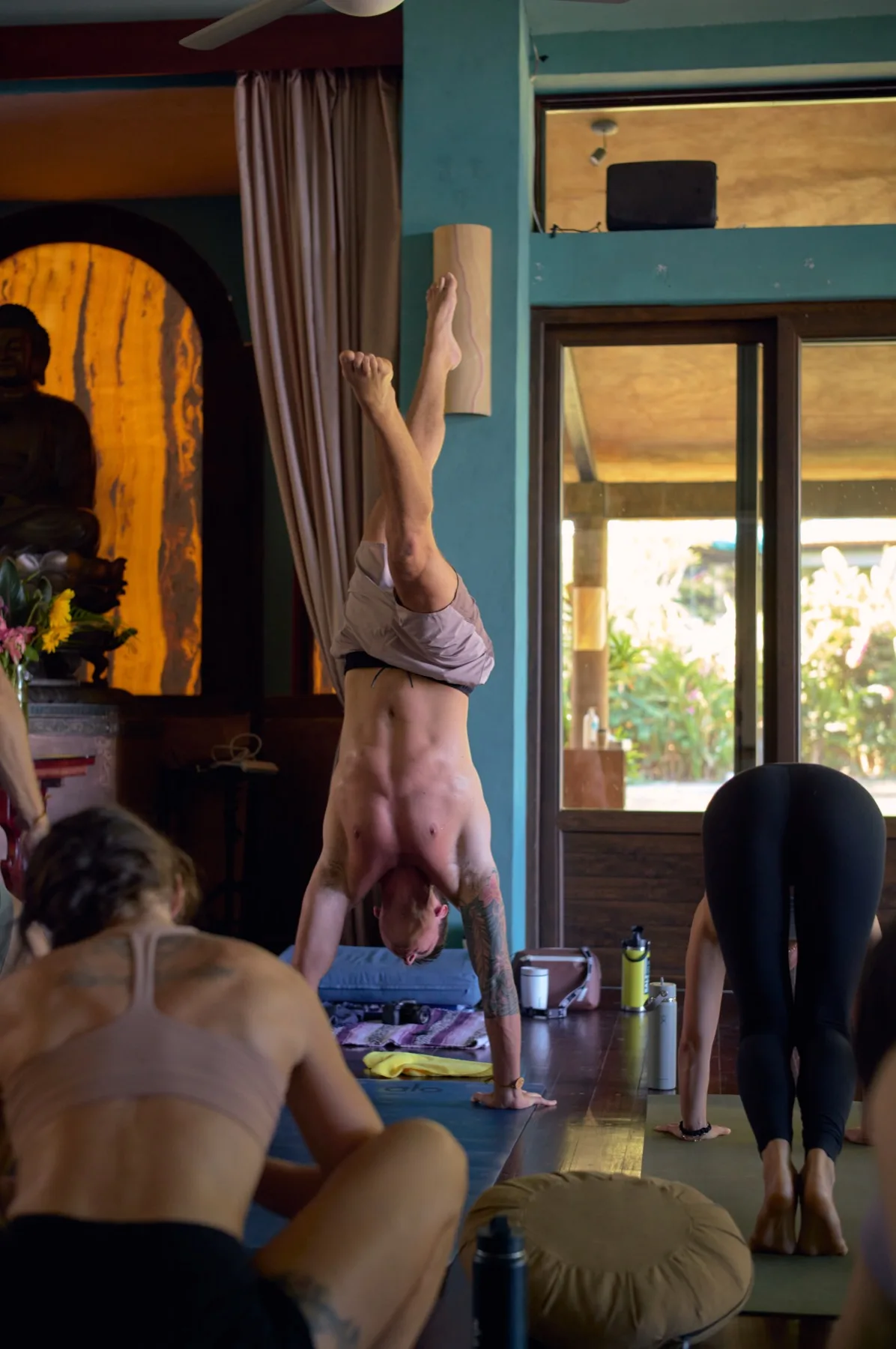
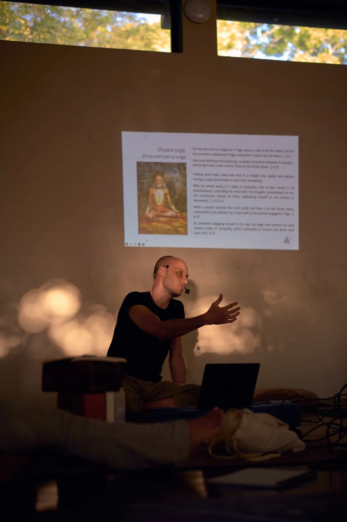
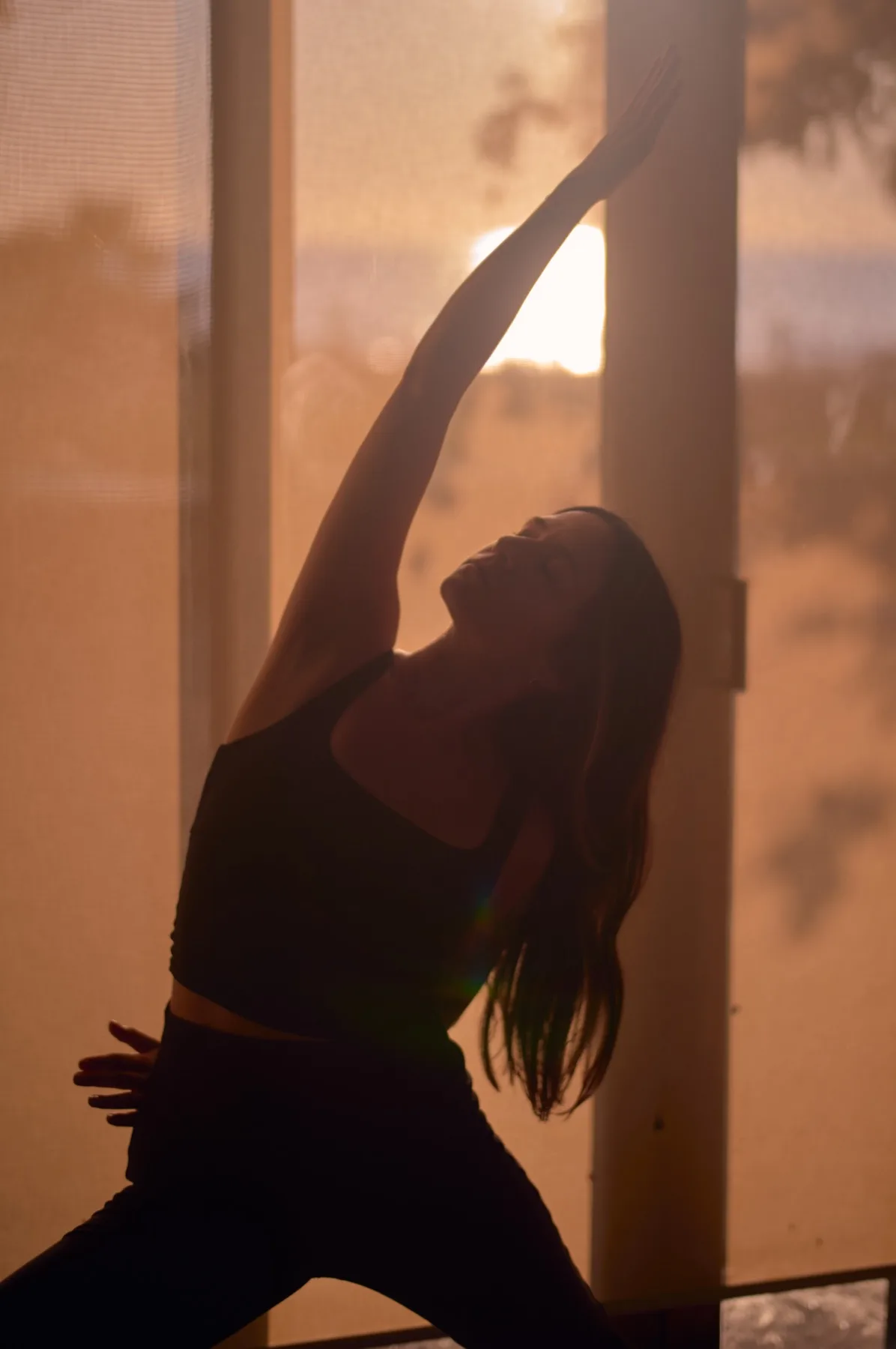
Open the live sitebecome-a-yogi.comBecome A Yogi is the teaching home of Jonah Kest, a third generation yoga teacher. The practice was being sold through social posts and a link in a bio. The teaching asks for depth, sequence and time. A feed gives it none of that. This build gave the practice a place of its own.
The question
How do you put a practice that takes years on a page that people read in seconds?
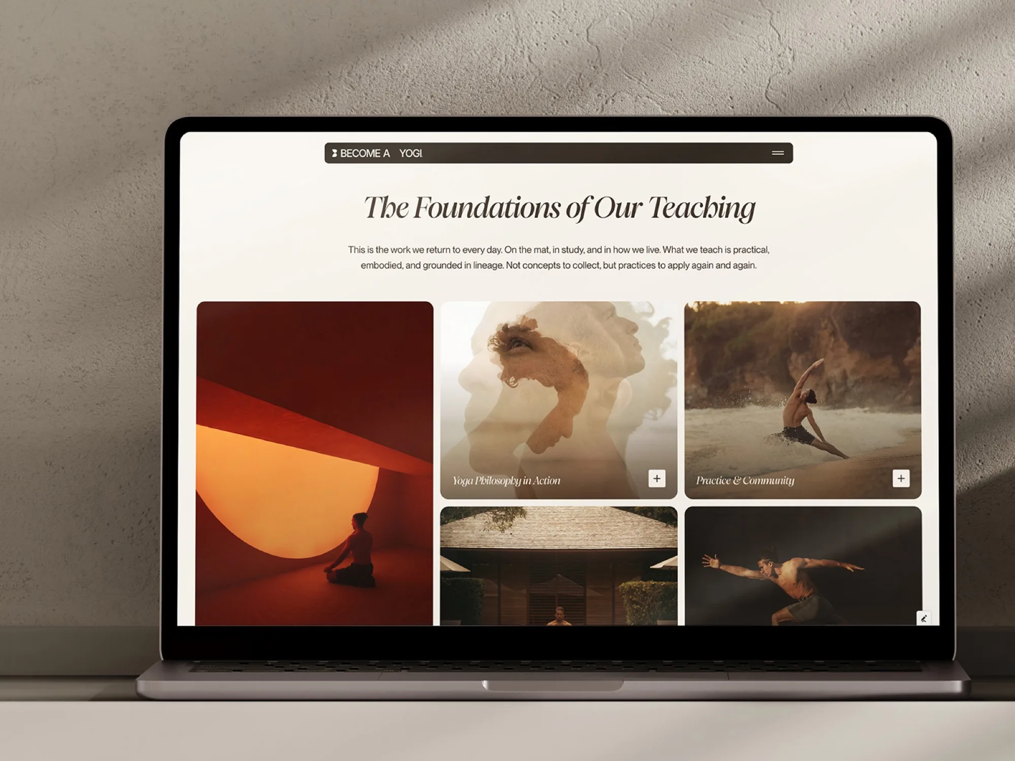
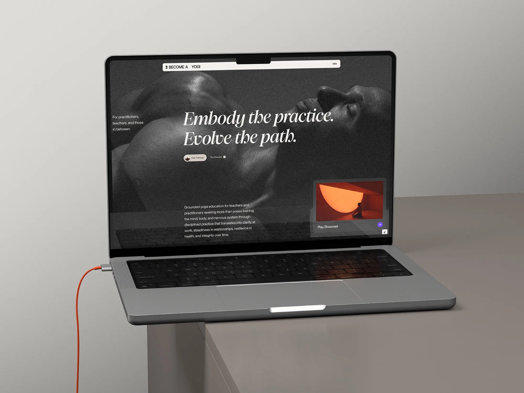
Every answer that adds more, more slides, more claims, more urgency, works against the thing being sold. So the site does the opposite. It slows the reader down on purpose: one idea per screen, long measures of type, and motion that follows the scroll instead of interrupting it.
%20(1).jpg)
The work
The type carries the brand. An editorial serif sets the voice, a monospaced face carries the labels, and nothing else is asked to decorate. Photography stays black and white so the teaching, not the styling, holds the attention.
Motion is the second argument. Page changes run through Barba so the site never blinks white between sections. Scrolling runs through Lenis, and every reveal is tied to the scroll position rather than to a timer, so the reader sets the pace.
What was left out matters as much. No countdown, no popup, no testimonial carousel, no urgency copy. A practice that has been taught for three generations does not need to shout on the first screen.

























What shipped
A full editorial home, built page by page in Webflow, with WebGL, smooth scroll and page transitions carried on a page weight most sites reach with far less on screen.


Jonah Kest on the finished site, recorded after launch. One minute, with sound.
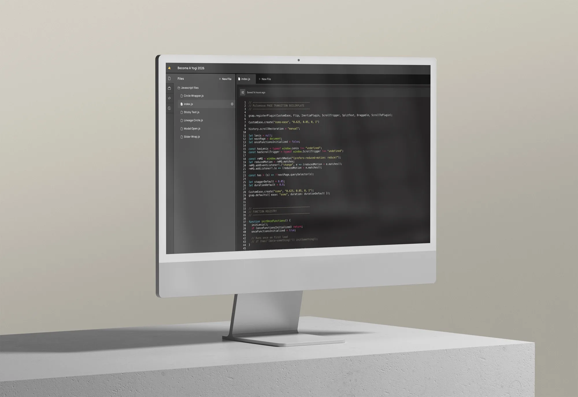
The build runs on GSAP, Lenis, Barba, Three.js, Unicorn Studio, Finsweet and Slater. One person designed and built it, shipping in weekly increments rather than one delivery at the end.